
Twitter Media

About THE PROJECT
In 2016, Twitter was struggling because it's perceived value had become dated. It’s resonant value was broadly understood but largely limited to ‘immediacy’. Competitors like Snapchat were increasingly eroding into that value proposition with highly media-driven, millennial-focused tools. Twitter had a team of partner managers equipped with the tools and resources needed to create great content on Twitter - but they could only service the top 1% of content creators. This wasn’t scalable to the rest of their target audience. So the brief became, how can we bring this knowledge to the other 99%? The resulting solution was Twitter Media, a responsive, content-driven experience to help content creators use Twitter first, often, and well.
My Role
Twitter partnered with Fantasy, where I freelanced as the lead UX designer, creating user flows, identifying the features and functionality, and designing wireframes. I attended client meetings at Twitter’s headquarters in San Francisco, and worked on the rest of the project out of Fantasy's SF office and remotely from LA.
THE AUDIENCE
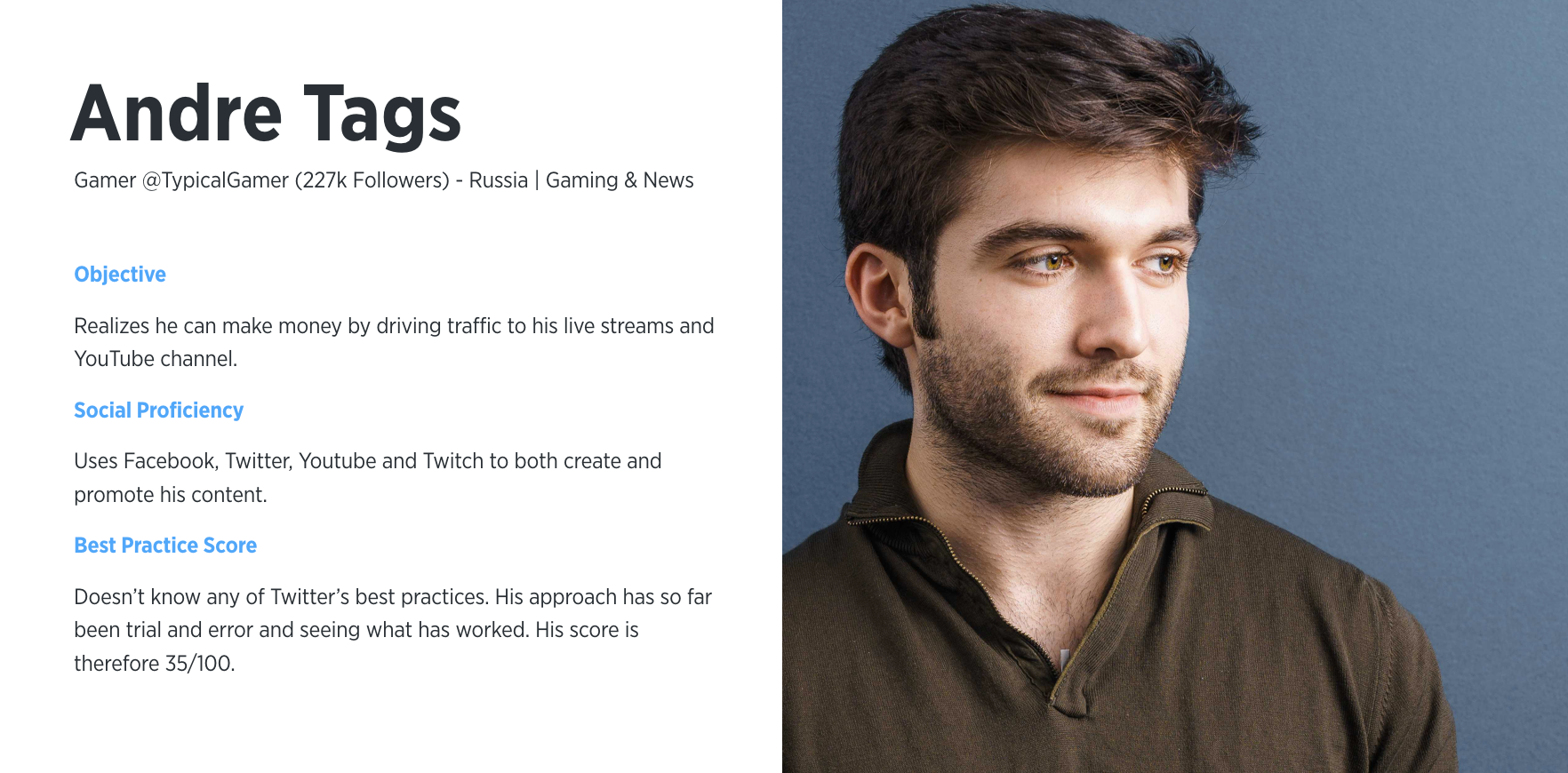
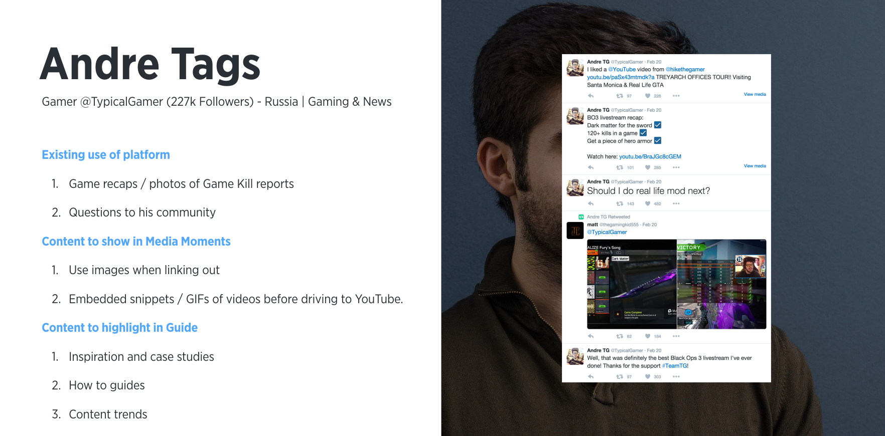
Twitter Media’s target audience are content creators who use Twitter deliberately to further objectives such as click throughs or brand promotion. Think fashion bloggers, PR managers or social media managers. Analyzing the audience through a series of characteristics such as objectives, market, industry vertical, and expertise level, we created archetypes like the following.
Features and Functionality
I documented the features in a shareable google spreadsheet. Going through this exercise allowed us to have a holistic view of all the included features and helped us understand the effort, scope and value of each individual feature to inform the project plan moving forward.

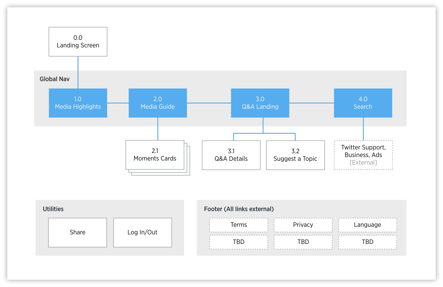
The Sitemap
From an architectural point of view, the structure was simple, with most of the navigation occuring contextually through content rather than through a traditional navigation.

User Flows
I broke down each of the key user flows step by step.
Lo-Fidelity Wireframes
I started out with low fidelity wireframes that illustrated the framework and movement of the site.

Hi-Fidelity Wireframes
They are then taken to the Guide, which is a customized library based on the user’s goals and usage information. The Guide contains bite-sized content cards that aim to inspire action and create greater awareness of Twitter’s value. The content itself addresses a variety of topics, how-to’s, best practices, case studies, insights and trends.
From there I created more detailed wireframes for desktop, tablet, and mobile screen sizes. The experience starts with the Media Report, which surfaces personalized data on the user’s past Twitter use. By scanning their tweets, we can score their activities, show them their progress from previous reports, and provide recommendations on how they can improve.


Visual Designs
Finally, our visual designers took the wireframes and created mock-ups like below.


